Beyond The Smile
During my final semester of study, I had the opportunity to work with FAST Australia on a real-world design brief as part of a collaborative team. FAST Australia supports individuals and families affected by Angelman syndrome, a rare genetic condition that has relatively low public awareness in Australia.
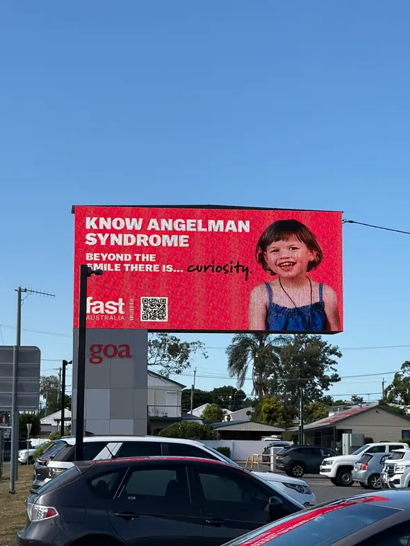
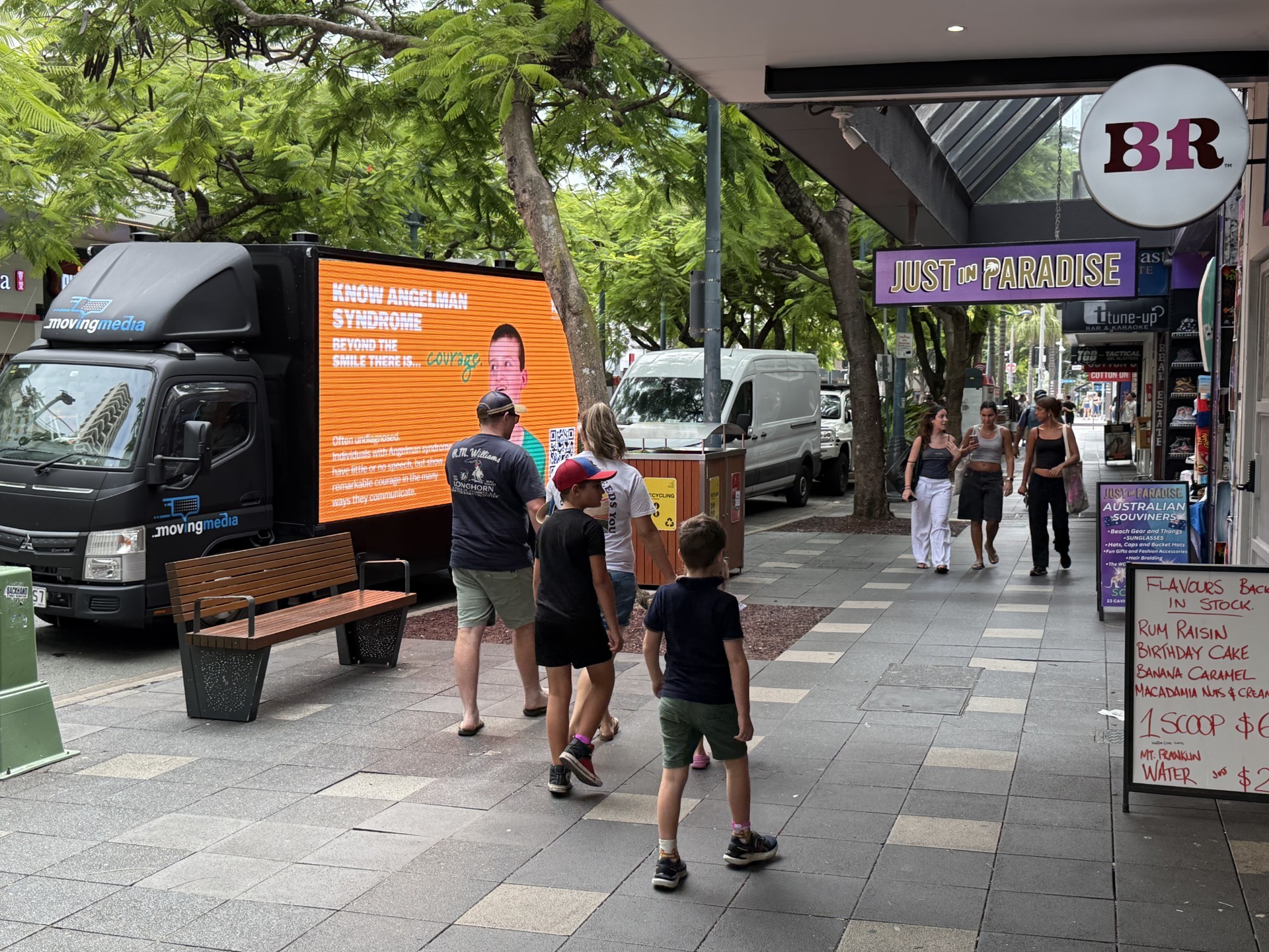
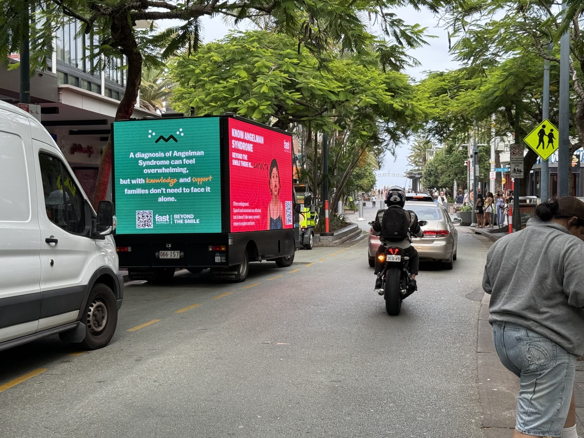
Together, we developed Beyond the Smile, a campaign designed to highlight the personalities, individuality and experiences of people living with Angelman syndrome beyond one of its commonly recognised characteristics — frequent smiling. The project involved the creation of a broad range of campaign assets, including social media templates, posters, educational leaflets, photography, 4K image editing and colour grading, billboard graphics now displayed in Queensland, and a fully functioning website prototype that FAST later incorporated into its live website.
The scale of the project gave me valuable experience in client communication, collaborative design, project organisation and translating a meaningful message across multiple visual formats.


It all began with the team meeting with Meagan, who was our main source of contact during this project. Due to our geographical boundaries, we made it work through zoom calls where we ideated together and came to amazing conclusions together. We generated the brightest concepts where we would fulfil all aspects of the campaign without being too vague or too strong which may draw people away from the whole campaign.
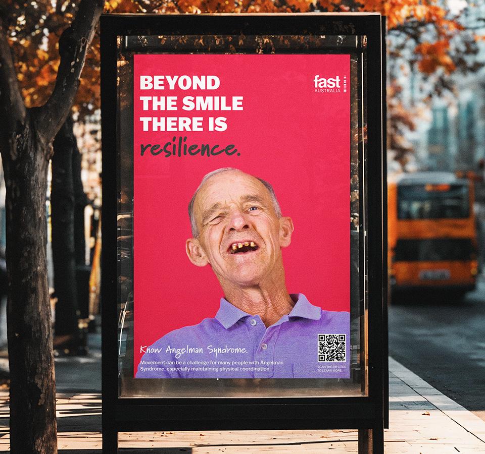

Our campaign slogan was structured in three parts. It begins with “Beyond the Smile…”, the campaign title, set in the primary brand typeface. This is followed by “there is…”, which acts as a bridge into a final word describing a different emotion or quality we observed in each individual with Angelman syndrome. By shifting the focus away from the condition itself and toward universal human emotions, the slogan celebrates each person’s individuality, personality and character.


The campaign was also rolled out across Queensland and some parts of NSW, appearing throughout public spaces on building displays, posters, billboards and moving trucks. Seeing the work exist beyond the screen and become part of the physical environment was incredibly rewarding. The campaign’s bold colour palette was designed to immediately capture attention, allowing the visuals to stand apart from the more muted and neutral tones often found throughout urban environments. This contrast gives the campaign a strong presence in each setting, helping the messaging feel both energetic and memorable. Seeing the finished designs photographed in real-world applications was a particularly exciting outcome of the project and demonstrated how effectively the visual identity translated across different formats and scales.